The general movement of sea-ice in the Arctic is dominated by the Beaufort Gyre and Transpolar Drift. These are illustrated in the graphic below.
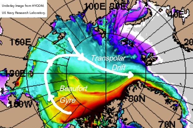
Figure 1. The Beaufort Gyre and Transpolar Drift.
The Beaufort Gyre is due to a semi-permanent high pressure system that tends to dominate weather in the Beaufort Sea, it drags ice around in a clockwise gyre, which is then entrained into the Transpolar Drift. The Transpolar Drift is a general flow of sea ice from Siberia, where ice is pulled from the coast creating new ice during the winter, the ultimate fate of the ice is then to be crushed up against the north coast of Greenland and the Canadian Arctic Archipelago (CAA). The crushing process is what forms the thicker ice in the graphic which is shown by reds and black, some of the ice then re-enters the Beaufort Gyre, or is driven from the Arctic to melt in the Fram Strait tongue of ice down the coast of Greenland.
Arctic sea ice can be divided into two broad categories, First Year Ice (FYI) is ice that has grown in the freeze season, Multi Year Ice (MYI) is ice that has survived at least one melt season. The Drift Age Model (DAM) is a relatively simple model when compared to an atmosphere/ocean climate model. In essence the DAM is an accounting and shifting exercise: Starting from the end of the melt season, in September, any ice within the September sea ice extent has survived the melt season and is aged one year. The ice is then tracked through the year as parcels, or pixels, of sea ice as it is moved around by wind. Crucially the age of a pixel is the age of the oldest bit of ice within that pixel, so a pixel could be 90% of 1 year old ice, with only 10% 3 years old, but it will still be categorised as 3 year old ice by the DAM. Maslanik and colleagues have produced a website showing their results using the DAM, this was discussed here at Neven's Sea Ice Blog. The following graphic is from NSIDC Sea Ice News for 4 April 2012. Maslanik time series
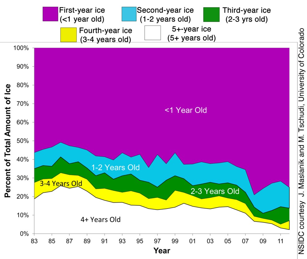
Figure 2. Extract from NSIDC graphic originally produced by J. Maslanik and M. Tschudi, Univ of Colorado. March percentage of sea-ice age categories.
This graphic shows the greatest loss of MYI as being from ice that is 4 years old and older, with recent years suggesting something of a recovery following losses in 2007. It staggers me that the typical cycling time of sea ice in the Arctic is as little as 3 to 4 years old. It might be considered that this is merely because we've only had 4 melt/freeze seasons since 2007, I don't think this is correct, as can be seen by the continued decline of ice older than 4 years old there is negligible addition to the stock of that ice from younger categories. More about the decline of MY ice later, but first there is other research into ice age.
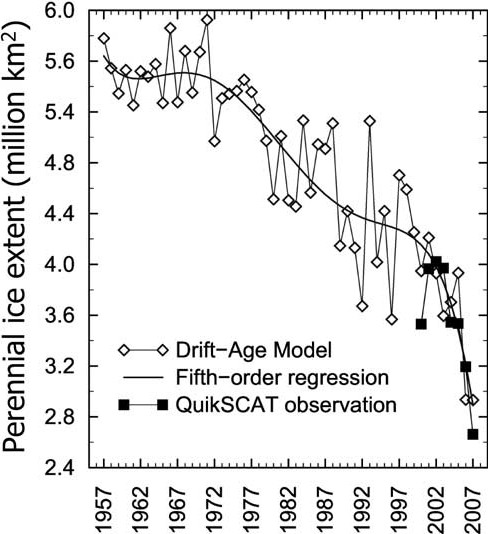
Figure 3, Figure 3 of Nghiem et al 2007, Perennial (MYI) sea ice extent from the DAM and from measurements using the QuikScat satellite system.
As I've previously discussed Nghiem et al 2007 reveals a precipitous drop in MYI which is not visible in results from Maslanik. Both Maslanik and Nghiem et al use the DAM, but the main focus of Nghiem's work is measurement of MYI using QuikScat. The difference between the two approaches seems to be that Nghiem leaves out a category of mixed ice from the production of figure 2, whereas in figure 1 Maslanik includes that category. Polyakov et al state that:
At the end of the 2010 summer, only 15% of the ice remaining in the Arctic was more than two years old, compared to 50%–60% during the 1980s. There is virtually none of the oldest (at least five years old) ice remaining in the Arctic (less than 60,000 km2 compared to 2 million km2 during the 1980s). Between 2005 and 2008 (Fig. 1), the Arctic Ocean lost 42% of its multiyear ice (MYI = ice which survives at least one Arctic summer) coverage.Maslanik is a conservative, and therefore highly defensible, measure of MYI changes. However as Polyakov imply, the Arctic once comprised of a core of thick multi year ice that was cycled round and aged in the Beaufort Gyre before being aged further in the Transpolar Drift. The difference between Maslanik and Nghiem is the fragmentation of the MYI. Nghiem shows that the previous monolithic mass of MYI comprising much of the central Arctic pack has crashed precipitously. This is a crash hidden by the ability of first year ice to 'hide the decline' in MYI due to its ability to grow fast during the Winter, it is also hidden when one lumps in mixed ice.
The Beaufort Gyre once acted as a 'flywheel' cycling ice round in the Beaufort sea, and ageing it as it moved round, before being entrained once more into the Transpolar Drift, to be crushed once more against the CAA. This flywheel has now failed, with the large extents of open water in Beaufort in recent years ice that is transported into that region is now entering a 'killing zone'. Where once the ice would cycle and age, now much of it is destined to melt. This is the reason for the precipitous crash in MY ice, and suggests that the average lifetime of ice off the CAA before being transported out to Fram or into the Beaufort killing zone is around four years. Haas et al, 2008, find that there is a regime shift before and after 2007. Before 2007 ice in the Transpolar Drift was mainly second year and MY ice, after 2007 it was mainly FY ice (new ice grown off the coast of Siberia). The accompanying drop in thickness was 20% in modal thickness.
The Beaufort Flywheel once stabilised the ice pack, with its failure thinner ice is more prone to melt due to anomalous weather conditions, this is because its Open Water Formation Efficiency (OWFE) has increased. OWFE is a measure of how effective melt is in generating open water. Take older thicker ice, which in the past was as thick as 3 metres (as previously discussed), if this loses 1m thickness in the melt season there is still ample thickness to go before revealing open water, so no open water forms. However ice that is around 1m thick will reveal open water in the melt season. That opening of open water is important due to the ice albedo effect - white ice reflects sunlight, replace it with dark ocean and the amount of sunlight absorbed increases substantially (at least 60%), this warms the ocean which melts more ice.
A crucial aspect of the situation in Beaufort is that now the MY ice is broken and fragmented, so open water can form around the thicker MY ice, warming the ocean and melting more of the ice. Barber et al document what has now come to be called 'rotten ice'.
A large sector of what was remotely sensed to be MY sea ice at 7 to 9+ tenths ice cover, consisting primarily of MY ice floes, was in fact a surface of heavily decayed ice composed of some small MY floes (1 tenth) interspersed in a cover dominated by heavily decayed FY floes (1 tenths) and overlain by new sea ice in areas of negative freeboard and in open water between floes.The rotten ice and the late season multiyear sea ice had overlapping radar and passive microwave signatures, so rotten ice was masquerading as MY ice. This shows the problem with Maslanik's DAM study of MY ice, much of the peripheries, particularly in Beaufort are probably comprised of rotten ice. However figure 2 suggests that the decline of MY ice older than 4 years old cannot continue for long, linear graphical extrapolation of the post 2007 trend implies a zero crossing by around 2014. However as the area of the CAA will trap old ice and probably maintain a residual of ice over 4 years old it seems unreasonable to me to expect a zero amount.
So I'm arguing that we are now effectively at the completion of a process that has been playing out for the last four decades (figure 3), the transition from a largely MYI pack to a largely FYI pack.
Barber et al, 2010, "The summer perennial pack ice in the southern Beaufort Sea is not as it appears." http://www.arcus.org/search/seaiceoutlook/2009_outlook/summary_report/downloads/pan-arctic/pdf/barber-etal-2009-summary-report.pdf
Haas et al, 2008, "Reduced ice thickness in Arctic Transpolar Drift favors rapid ice retreat." http://www.agu.org/pubs/crossref/2008/2008GL034457.shtml
Nghiem et al, 2007, "Rapid reduction of Arctic perennial sea ice." http://seaice.apl.washington.edu/Papers/NghiemEtal2007_MYreduction.pdf
6 comments:
It is getting very close to a summer with an ice free Arctic or as near as damm it.
I have watched the NSIDC graphic of ice ages for a few years seeing the decline you note.
One thing that is very important to remember and something that wasn't apparent to me the first few times I saw versions of this graph - It shows the age of the ice as a percentage of the total amount of ice but that total amount has been in decline for decades now.
So in effect it is a lot worse than it appears to be at first glance, not only has the percentage of old ice dropped, but the amount of ice that percentage represents has fallen significantly as well.
I agree. Is it possible to multiply the percentages with the total amount of ice (yearly average) that will show the extent of the trouble that we are in?
I don't see any contradiction between the Maslanik and Nghiem figures.
First, note that the Nghiem figure shows "perennial" ice - this is defines as all ice >1 year old. Next, note that the Nghiem graph runs from 1957 to 2007.
With that in mind, the Maslanik graph shows it dropping from ~45% to ~20% between 1983 and 2007. The corresponding figures on the Nghiem graph is a drop from ~4.6 million km^2 to ~2.6 million km^2. If anything, the Nghiem drop is slightly more conservative than Maslanik's figures.
Overall, the two are almost exactly comparable: I don't see any need to invoke issues of mixed ice / partial MYI pixels.
Peter,
During the period of rapid decline in the Nghiem figure (fig 3) there is a massive drop, yet at the same time Maslanik (fig 2) shows little drop. I emailed Dr Maslanik about this discrepancy and he was kind enough to explain that the difference is in the treatment of mixed ice. Nghiem discounts mixed ice from his graph, Maslanik includes it, with parcels containing mixed ice assuming the age of the oldest ice in the parcel.
Hence what I see is that hidden within the Maslanik approach is information about the fragmentation of ice that is the cause of the precipitous drop in Nghiem's graph.
Lazarus, Dr Tskoul,
Bear in mind that figure 2 is for March extent. In March the extent within the Arctic basin is 100%, the decline in peripheral oceans outside the Arctic Ocean has little bearing on amounts of thick ice, which is concentrated within the Arctic. In fact the decline of sea ice outside the central Arctic should increase the % contrbution of MYI, but the MYI is declining much faster than March extent.
I'd love to have these figures in extent / area and tabular rather than graphical form.
Chris: Really, if you line up the two graphs using the same X and Y axes they overlap almost perfectly. Let me know an email and I can mail you the picture!
Peter,
I've just done a calculated scaling of the two graphs and they are very close. Thanks.
Post a Comment